

 Millions of people visit GOV.UK every week to complete essential and often complex tasks. It’s crucial that we help users find what they need, and quickly.
As the newly-published blueprint for a modern digital government sets out, reducing the ‘time tax’ on people using public services is one of our top priorities. Making people’s lives easier, by cutting down the time and energy it takes to access public services, is one of the 5 outcomes we – and others across the expanded Government Digital Service – are striving towards.
One way we can enable this is by focusing on the user journey experience – the way people navigate around the pages on GOV.UK to find what they’re looking for.
Over the last couple of years we’ve done a lot of work to improve how people navigate GOV.UK. We redesigned our topic pages to make them more accessible, we simplified the sub-topic pages to make them easier to use, and we made significant updates to the GOV.UK homepage.
The topic pages aim to help people find the GOV.UK guidance or service they require. These pages include things like driving and transport and money and tax.
We’ve recently returned to the topic pages to make 2 improvements:
- changing the layout from a ‘grid’ design to a list design
- introducing a section at the top of the page to display useful links to content – which we’ve called ‘Most viewed’
Keeping it simple from a grid to a list
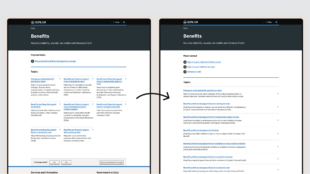
The design layout of the page is a really important part of helping to navigate to the right information. Have you ever noticed that some websites display information in a grid format, while others use a list? As a general rule, lists are better for text-based content, like the information you’ll find on GOV.UK. Lists are easier to scan and our eyes naturally follow a list format, making it more intuitive to navigate. To test this theory we ran an A/B test where half of our users were shown a grid design of the page, and the other half saw a list design. This allowed us to compare how people responded to the 2 layouts.
We found that:
- the list design helped people find content faster, with less time spent on the page
- clickthrough rates on the list design were slightly higher
- people on desktop devices searched less, suggesting they were finding what they needed more easily
These results informed our decision to change the design from a grid to a list to make the page more intuitive to navigate.
Getting the links right through testing

Our aim with the ‘Most viewed’ section is to save people’s time by providing them with a shortcut to the highest-traffic pages.
We carried out usability testing to help us understand how people perceive and use links positioned at the top of the page. We asked participants to complete tasks on the topic pages and varied the number of links they were shown.
We learned that:
- lists of 3 to 6 links were preferable, regardless of device
- displaying links in this way felt familiar and helped people to navigate efficiently
We also observed that people were scanning for keywords when presented with the page. They weren’t necessarily reading the heading title or paying attention to how the page was structured, they were just keen to find words that related to the task they had in mind.
We conducted multivariate tests (MVT) to evaluate 3 different options:
- links based on the ‘most viewed content’ related to the topic
- links based on the ‘most searched for’ content in the topic
- no links at the top of the page (serving as the control in our tests)
The tests gave us valuable data to help us understand how people engaged differently with the links we presented them.
We found that:
- people interacted more with the pages that had these links
- people searched less on the pages with the links, and they clicked on subtopics less often – this suggests that the links made it easier for them to find what they were looking for
- we had more clicks on desktop devices compared to mobile devices – but across all devices our tests did significantly better than the pages without any links
The most efficient solution proved to be the test that showed ‘most viewed content’ in each topic. We’ve now rolled out the new links, based on this option, to all 16 topic pages.
During testing, the new section of links was named ‘Popular tasks’. Based on feedback from our user research, we changed this to ‘Most viewed’. We did this to ensure the title of the section was informative and helped people understand why these links were being suggested to them.
Iterating and improving
Our work to introduce ‘Most viewed’ links and the new list design demonstrates how we constantly iterate GOV.UK to make it easier for people to navigate to the information they need. We’re now looking for more areas where we can improve navigation using data and insights, as well as continuing to monitor the impact of the most recent changes.


