GOV.UK has a vast website estate. There are more than 700,000 pages covering an enormous range of topics to deliver our mission of being the single, trusted online home for the UK government.
The majority of this content is created with Whitehall Publisher. Introduced in the early days of GOV.UK, this is an in-house content management system (CMS) which is used by over 2,000 civil servants to upload, manage and amend content.
Over the last year we’ve been making improvements to Whitehall, including simplifying the way images are added. Now we’ve completed a bigger overhaul of the CMS – moving its user interface, the part of the system publishers see and interact with, to the GOV.UK Design System. We did this to make the CMS more accessible, and make it quicker and easier to publish content. This has simplified the publishing process for civil servants and, in turn, means the millions of people that use GOV.UK every single day get vital information more quickly.
Here’s how we achieved this important transition and what happens next.
Why we moved to the GOV.UK Design System
The GOV.UK Design System is a set of styles, components and patterns that help teams in government create user-centred digital services.
Moving to the GOV.UK Design System brings a number of benefits. The colours, font sizes, and components it contains were built to be accessible for all users, including those who require assistive technologies to navigate online services. Meanwhile updating the user interface makes the codebase – the text written in the programming language that Whitehall was built with – less complex. This will lead to a better experience for developers when they make future improvements to Whitehall.
How we updated Whitehall
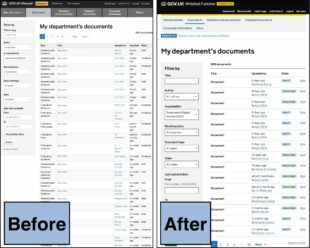
Replacing Whitehall’s existing styles and components with those found in the GOV.UK Design System was a big task, especially given publishers needed to continue using the CMS to do their jobs. With this in mind, the approach we took was to convert Whitehall like-for-like to the design system. The image below shows how document search has been changed in this way.

Converting like-for-like meant the design system’s styles and components would be used, while keeping the existing layout and functionality of Whitehall’s individual pages.
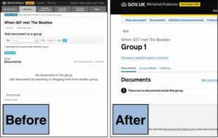
However, where there were no suitable replacements for parts of Whitehall in the design system, the team took the chance to re-imagine how these aspects of the CMS could work, in line with the design system’s principles. The image below shows how the document collection user interface has been changed in this way.

For instance, tasks such as reordering content, adding, removing and searching material used to happen on the same page, but now they are on their own page, each with a unique URL.
At GDS we work in an agile way. This means our teams build quickly, test what they’ve built and iterate their work based on regular feedback. So, as we were improving Whitehall, we decided to release the updates in manageable packages as opposed to waiting until it was all complete. Before a release, the team communicated the changes to publishers via Basecamp.
In addition, the guidance to using the application is edited to reflect the latest design and/or functionality updates. Every time a release happens, our users let us know what’s working and what isn’t via Basecamp, Zendesk as well as the Publisher Survey. If anything needs to be revisited the team quickly responds and makes any necessary improvements.
How publishers’ experience has improved
After one-and-a-half years, and more than 10 release packages, Whitehall’s transition to the GOV.UK design system is complete, and all traces of the previous styles and components have been removed. Here’s what some of our publishers across government have to say about the changes:
“There have been a fair few changes to the app, all positive. It’s easier to use, especially for people new to Whitehall; it’s more intuitive.” (Content Designer, Home Office)
“…the fact you’ve made it clearer for colleagues just joining us while, at the same time, not interrupting my work is really positive.” (Lead Content Designer, Environment Agency)
Our next steps
Although the transition has now finished, a dedicated team is exploring how we can further improve and iterate the overall user experience of Whitehall. This offers us the chance to re-imagine many of the publishing app’s existing functionalities from the ground up.


